

Why Design Matters More Than Ever
Picture this: You land on a website, ready to buy something you’ve been eyeing for weeks. But the page takes forever to load, the menu is a mess, and you can’t even find the checkout button. Annoying, right? Chances are, you’d bounce within seconds and take your money elsewhere. That’s exactly why e-commerce design is so important.
It’s not just about making things look pretty. Your website’s layout, navigation, and functionality directly impact whether a visitor turns into a paying customer. Smart design choices remove friction, making shopping easy, intuitive, and enjoyable. And when customers enjoy the process, they buy more. It’s that simple.
Make Navigation Effortless
Clear and Simple Menus
If people can’t find what they’re looking for in a few clicks, they’re out. Your navigation should be so intuitive that even your tech-challenged uncle could figure it out. Keep menus clear, categories logical, and subcategories to a minimum.
Search That Actually Works
A solid search bar is a game changer. It should be easy to spot and smart enough to suggest relevant products as users type. Filters and sorting options help too—especially for stores with tons of products.
Minimise Clicks to Checkout
The fewer clicks between finding a product and buying it, the better. Make sure key pages like “Shop,” “Cart,” and “Checkout” are easy to access at all times.
Optimise for Mobile Shopping
Mobile-First, Not Mobile-Second
Most online shopping happens on phones now, so your site needs to work flawlessly on mobile. That means responsive design, fast load times, and big, tap-friendly buttons.
Avoid Tiny Fonts and Cramped Layouts
No one wants to pinch and zoom to read a product description. Make sure text is readable, buttons are easy to tap, and images are clear on all screen sizes.
Streamline the Mobile Checkout
Typing out an entire address on a tiny keyboard is painful. Auto-fill options, saved payment info, and a simple, step-by-step process make checkout much smoother.

Prioritise High-Quality Product Visuals
Show, Don’t Just Tell
Since customers can’t physically touch your products, your images need to do the heavy lifting. High-res, well-lit photos from multiple angles help build trust and reduce uncertainty.
Zoom, 360 Views, and Videos
People want to inspect details, so let them zoom in. Even better, 360-degree views and videos give them a real feel for the product.
Lifestyle Shots Sell More
A plain white background is fine, but showing your product in real-life settings helps customers picture it in their own lives. That emotional connection? That’s what gets them to hit “Buy.”
Simplify the Checkout Process
Guest Checkout Is a Must
Not everyone wants to make an account just to buy something. Give people the option to check out as a guest. If they love your store, they’ll come back and sign up later.
Only Ask for What’s Necessary
Every extra form field is another reason for someone to abandon their cart. Keep it short and sweet—name, shipping info, and payment details should be enough.
Progress Indicators Reduce Anxiety
Let customers know how many steps are left. A simple “Step 1 of 3” keeps them from feeling like they’re stuck in an endless checkout loop.
Keep It Simple, Even If You’re Not a Full E-Commerce Store
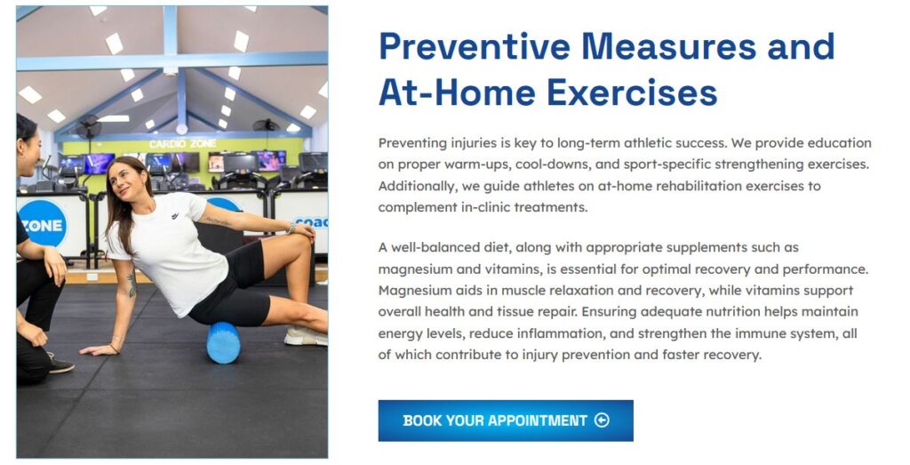
Even if your site isn’t a full-fledged online store, but you have some kind of payment gateway, the checkout process still needs to be as smooth as possible. Take AppliedMotion, a physiotherapy clinic in Leederville, for example. They offer online scheduling for appointments, and we were tasked with simplifying their booking and payment process. By removing unnecessary steps and making the flow more intuitive, we made it easier for customers to complete their bookings without frustration. Whether you’re selling products or services, a clutter-free, efficient checkout experience makes all the difference.
Build Trust Instantly
Customer Reviews Matter
People trust other shoppers more than they trust your marketing copy. Make reviews prominent, and if you can, allow photo uploads so buyers can show off what they received.
Secure Payment Badges
Trust signals like SSL certificates, PayPal/Visa logos, and “Secure Checkout” messaging help reassure customers that their info is safe.
Clear Return Policies
Nobody wants to feel trapped in a bad purchase. A clear, fair return policy makes people more comfortable clicking “Buy Now.”
Speed Matters: Optimise for Performance
Fast Loading = More Sales
If your site takes more than a few seconds to load, you’re losing money. Compress images, use a content delivery network (CDN), and clean up unnecessary scripts to keep things snappy.
Kill Annoying Pop-Ups
One well-timed pop-up for a discount? Fine. But constant interruptions make people want to leave. Use them sparingly, and never block the whole screen.
Keep It Clean and Simple
A cluttered website overwhelms users. Stick to a minimalist design with plenty of white space, clear CTAs, and a logical flow.
The Bottom Line
A great e-commerce website isn’t just about looks—it’s about making shopping effortless. When navigation is easy, images are high-quality, checkout is painless, and the site loads fast, people buy more. And that’s the goal, right? Small tweaks can make a huge difference, so start by fixing the biggest pain points first. Happy selling!